Edbert
Well-Known Member
- Joined
- May 16, 2024
- Messages
- 606
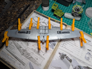
Build is underway, really enjoying these kits!
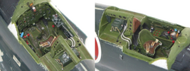
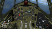
Based on my experience with their Bf109, it was better to use their opaque dash and insert a decal for each gauge as opposed to the sheet of gauges adhered behind a clear plastic (painted of course) dashboard. So without really looking close enough I started down that path with this one. Turns out there's only one decal for gauges and they are all combined. I did consider cutting each one out, but only briefly. I chose to use the clear version.
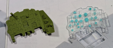
That panel on the right side will be moved over after painting.
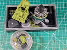
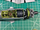
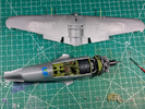
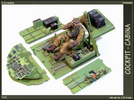
The engine was really complex, and is incomplete in this shot. The cockpit base is complete but just a base coat of color before adding detail paint and a clear.
Based on my experience with their Bf109, it was better to use their opaque dash and insert a decal for each gauge as opposed to the sheet of gauges adhered behind a clear plastic (painted of course) dashboard. So without really looking close enough I started down that path with this one. Turns out there's only one decal for gauges and they are all combined. I did consider cutting each one out, but only briefly. I chose to use the clear version.

That panel on the right side will be moved over after painting.

The engine was really complex, and is incomplete in this shot. The cockpit base is complete but just a base coat of color before adding detail paint and a clear.

